Core Components
Number Effects
Interactive Elements
Advanced Effects
Radix UI Components
- Accordion
- Alert
- Alert Dialog
- Aspect Ratio
- Avatar
- Badge
- Breadcrumb
- Button
- Button Group
- Calendar
- Card
- Carousel
- Chart
- Checkbox
- Collapsible
- Combobox
- Command
- Context Menu
- Data Table
- Date Picker
- Dialog
- Direction
- Drawer
- Dropdown Menu
- Empty
- Field
- Hover Card
- Input
- Input Group
- Input OTP
- Item
- Kbd
- Label
- Menubar
- Native Select
- Navigation Menu
- Pagination
- Popover
- Progress
- Radio Group
- Resizable
- Scroll Area
- Select
- Separator
- Sheet
- Sidebar
- Skeleton
- Slider
- Sonner
- Spinner
- Switch
- Table
- Tabs
- Textarea
- Toast
- Toggle
- Toggle Group
- Tooltip
- Typography
Base UI Components
- Accordion
- Alert
- Alert Dialog
- Aspect Ratio
- Avatar
- Badge
- Breadcrumb
- Button
- Button Group
- Calendar
- Card
- Carousel
- Chart
- Checkbox
- Collapsible
- Combobox
- Command
- Context Menu
- Data Table
- Date Picker
- Dialog
- Direction
- Drawer
- Dropdown Menu
- Empty
- Field
- Hover Card
- Input
- Input Group
- Input OTP
- Item
- Kbd
- Label
- Menubar
- Native Select
- Navigation Menu
- Pagination
- Popover
- Progress
- Radio Group
- Resizable
- Scroll Area
- Select
- Separator
- Sheet
- Sidebar
- Skeleton
- Slider
- Sonner
- Spinner
- Switch
- Table
- Tabs
- Textarea
- Toast
- Toggle
- Toggle Group
- Tooltip
- Typography
Progressive blur#
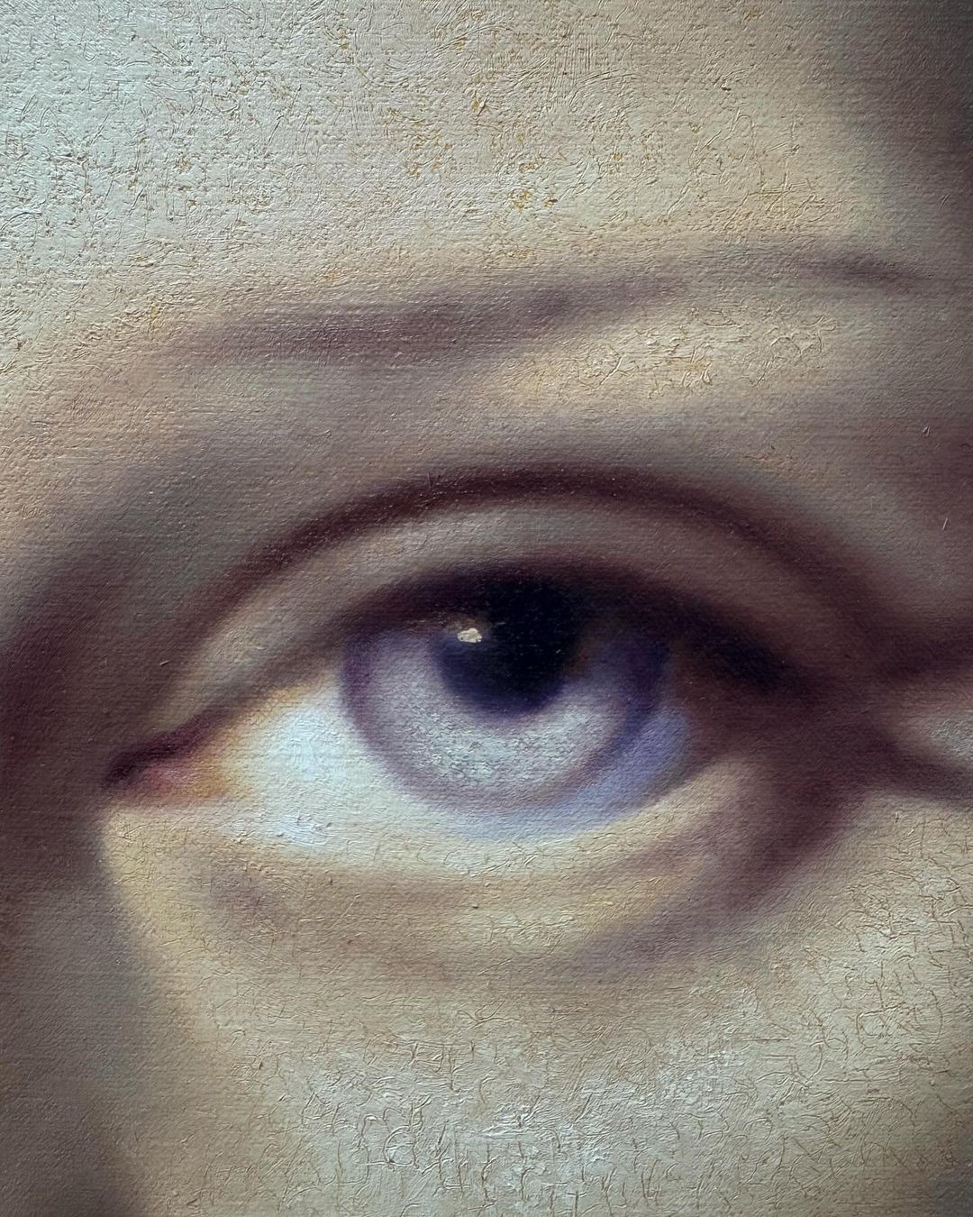
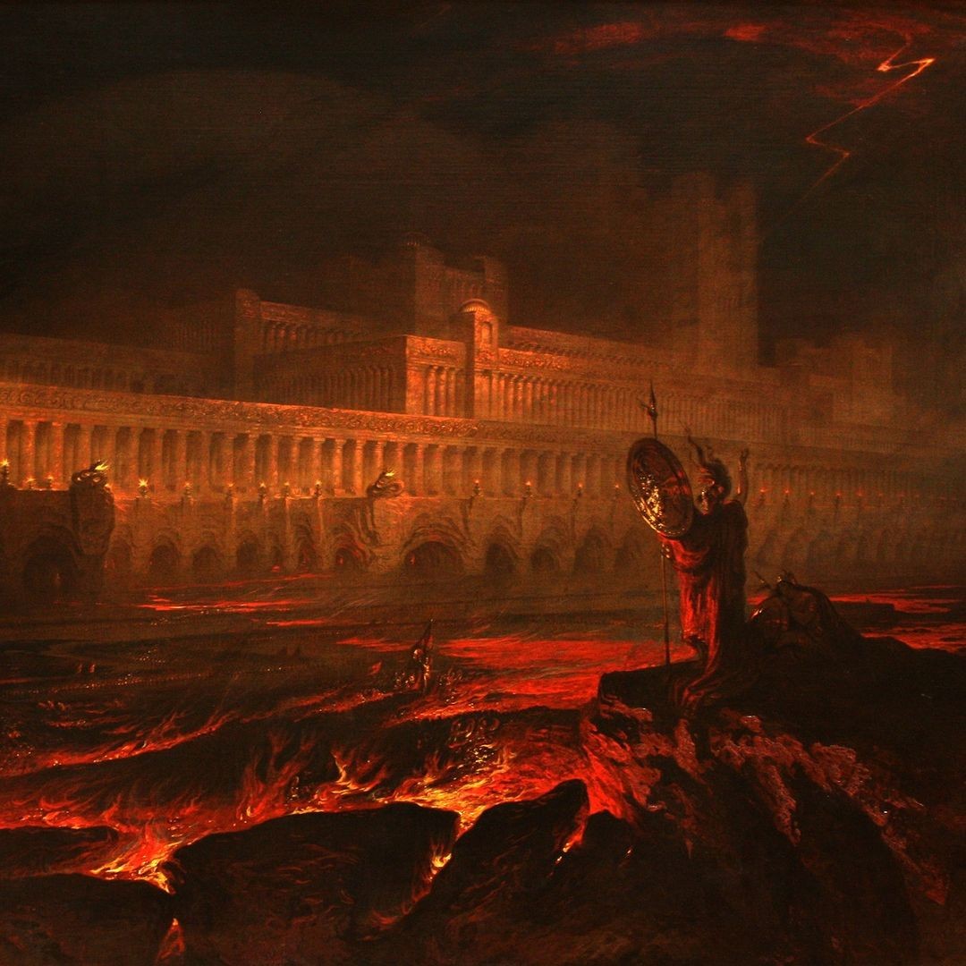
A Progressive Blur component creates a layered blur effect using motion and gradient masks. It progressively blurs layers based on direction and intensity, adding visual depth.
Examples#
Progressive blur basic#
Benjamin Spiers
Moonlight 2023Oil on linen. 40cm by 30cm
Progressive blur with hover#
John Martin
PandemoniumProgressive blur with slider and different directions#
You can change the direction of the blur effect with the direction prop.
1
2
3
4
5
6
7
8
9
1
2
3
4
5
6
7
8
9
Installation#
npx shadcn@latest add "https://components.dylanwlim.com/c/progressive-blur.json"
Component API#
ProgressiveBlur#
| Prop | Type | Default | Description |
|---|---|---|---|
| direction | 'top' | 'right' | 'bottom' | 'left' | 'top' | The direction of the blur effect. |
| blurLayers | number | 8 | The number of blur layers. |
| className | string | '' | The class name to apply to the component. |
| blurIntensity | number | 0.25 | The intensity of the blur effect. |
Build with DWL Components
Use the copied registry, charts, blocks, and create tools in one place.
Start from the DWL Components create flow and customize from there.
Open DWL Components Create