Core Components
Number Effects
Interactive Elements
Advanced Effects
Radix UI Components
- Accordion
- Alert
- Alert Dialog
- Aspect Ratio
- Avatar
- Badge
- Breadcrumb
- Button
- Button Group
- Calendar
- Card
- Carousel
- Chart
- Checkbox
- Collapsible
- Combobox
- Command
- Context Menu
- Data Table
- Date Picker
- Dialog
- Direction
- Drawer
- Dropdown Menu
- Empty
- Field
- Hover Card
- Input
- Input Group
- Input OTP
- Item
- Kbd
- Label
- Menubar
- Native Select
- Navigation Menu
- Pagination
- Popover
- Progress
- Radio Group
- Resizable
- Scroll Area
- Select
- Separator
- Sheet
- Sidebar
- Skeleton
- Slider
- Sonner
- Spinner
- Switch
- Table
- Tabs
- Textarea
- Toast
- Toggle
- Toggle Group
- Tooltip
- Typography
Base UI Components
- Accordion
- Alert
- Alert Dialog
- Aspect Ratio
- Avatar
- Badge
- Breadcrumb
- Button
- Button Group
- Calendar
- Card
- Carousel
- Chart
- Checkbox
- Collapsible
- Combobox
- Command
- Context Menu
- Data Table
- Date Picker
- Dialog
- Direction
- Drawer
- Dropdown Menu
- Empty
- Field
- Hover Card
- Input
- Input Group
- Input OTP
- Item
- Kbd
- Label
- Menubar
- Native Select
- Navigation Menu
- Pagination
- Popover
- Progress
- Radio Group
- Resizable
- Scroll Area
- Select
- Separator
- Sheet
- Sidebar
- Skeleton
- Slider
- Sonner
- Spinner
- Switch
- Table
- Tabs
- Textarea
- Toast
- Toggle
- Toggle Group
- Tooltip
- Typography
April 2026 - Introducing Sera
Minimal. Editorial. Typographic. Underline Controls and Uppercase Headings. Shaped by Print Design Principles.
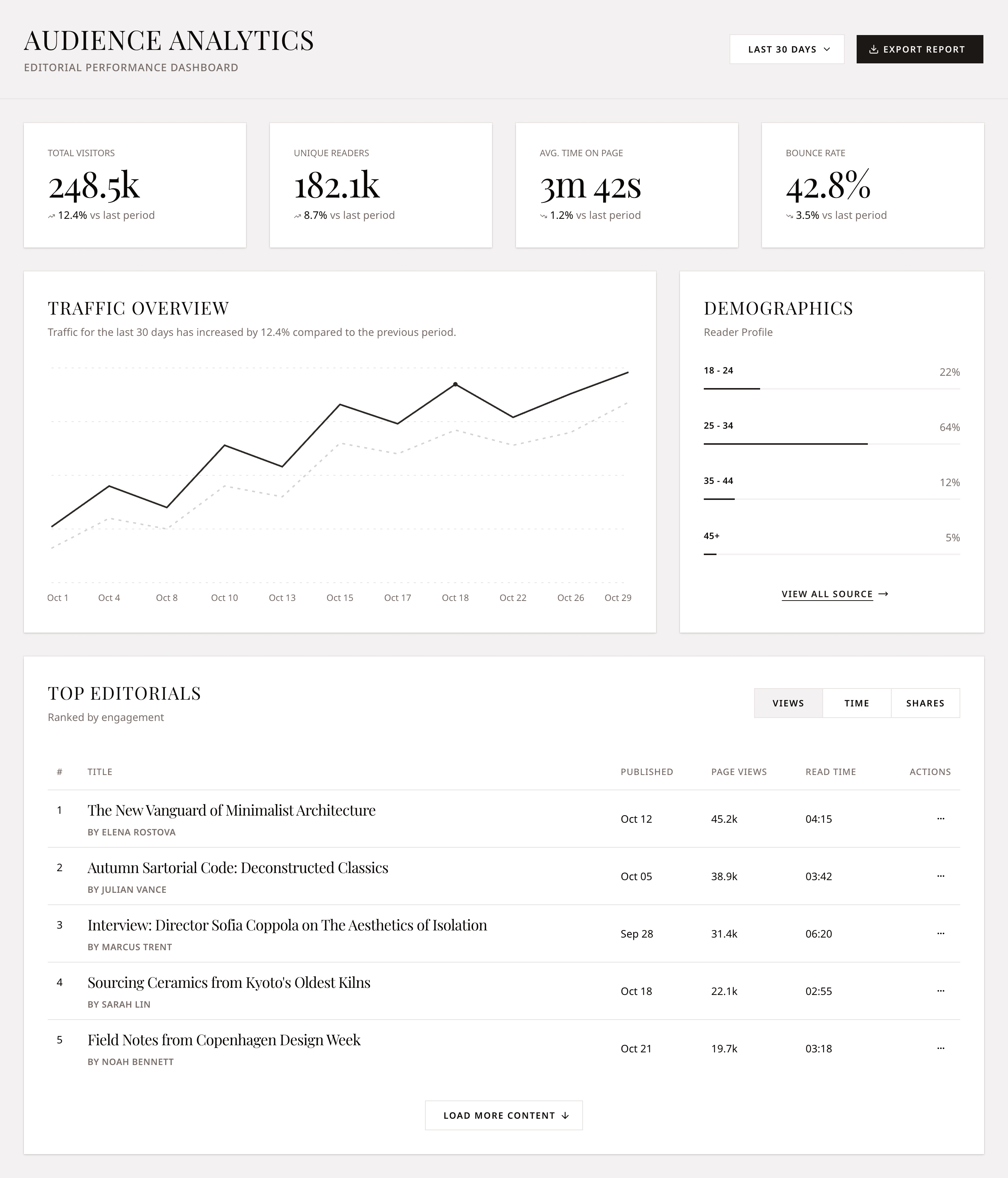
Introducing Sera, a new DWL Components style. Minimal. Editorial. Typographic. Underline Controls and Uppercase Headings. Shaped by Print Design Principles.

Try Sera in DWL Components/create
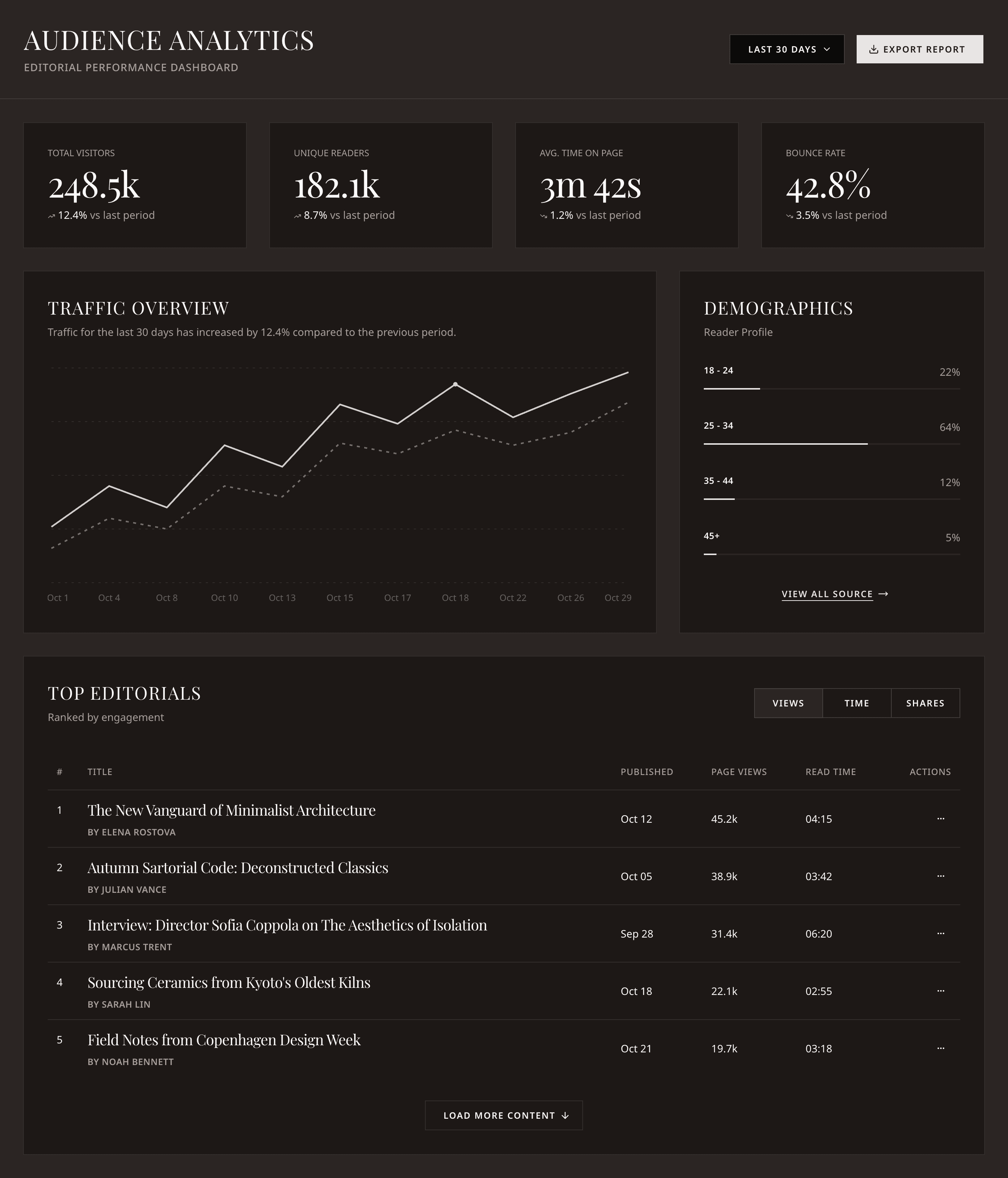
Sera is a typography-first style built on print design principles. It pairs serif headings with sans-serif body text, uses square corners, uppercase tracking, and underlined controls to create an editorial feel for your app.
Like the other new styles, Sera goes beyond theming. It changes the geometry, spacing, and feel of the components so your app starts from a different visual baseline.
Available now in DWL Components/create for both Radix and Base UI.
Try Sera
Build with DWL Components
Use the copied registry, charts, blocks, and create tools in one place.
Start from the DWL Components create flow and customize from there.
Open DWL Components Create