Core Components
Number Effects
Interactive Elements
Advanced Effects
Radix UI Components
- Accordion
- Alert
- Alert Dialog
- Aspect Ratio
- Avatar
- Badge
- Breadcrumb
- Button
- Button Group
- Calendar
- Card
- Carousel
- Chart
- Checkbox
- Collapsible
- Combobox
- Command
- Context Menu
- Data Table
- Date Picker
- Dialog
- Direction
- Drawer
- Dropdown Menu
- Empty
- Field
- Hover Card
- Input
- Input Group
- Input OTP
- Item
- Kbd
- Label
- Menubar
- Native Select
- Navigation Menu
- Pagination
- Popover
- Progress
- Radio Group
- Resizable
- Scroll Area
- Select
- Separator
- Sheet
- Sidebar
- Skeleton
- Slider
- Sonner
- Spinner
- Switch
- Table
- Tabs
- Textarea
- Toast
- Toggle
- Toggle Group
- Tooltip
- Typography
Base UI Components
- Accordion
- Alert
- Alert Dialog
- Aspect Ratio
- Avatar
- Badge
- Breadcrumb
- Button
- Button Group
- Calendar
- Card
- Carousel
- Chart
- Checkbox
- Collapsible
- Combobox
- Command
- Context Menu
- Data Table
- Date Picker
- Dialog
- Direction
- Drawer
- Dropdown Menu
- Empty
- Field
- Hover Card
- Input
- Input Group
- Input OTP
- Item
- Kbd
- Label
- Menubar
- Native Select
- Navigation Menu
- Pagination
- Popover
- Progress
- Radio Group
- Resizable
- Scroll Area
- Select
- Separator
- Sheet
- Sidebar
- Skeleton
- Slider
- Sonner
- Spinner
- Switch
- Table
- Tabs
- Textarea
- Toast
- Toggle
- Toggle Group
- Tooltip
- Typography
June 2025 - Calendar Component
Upgraded Calendar component with React DayPicker and 30+ calendar blocks.
We've upgraded the Calendar component to the latest version of React DayPicker.
This is a major upgrade and includes a lot of new features and improvements.
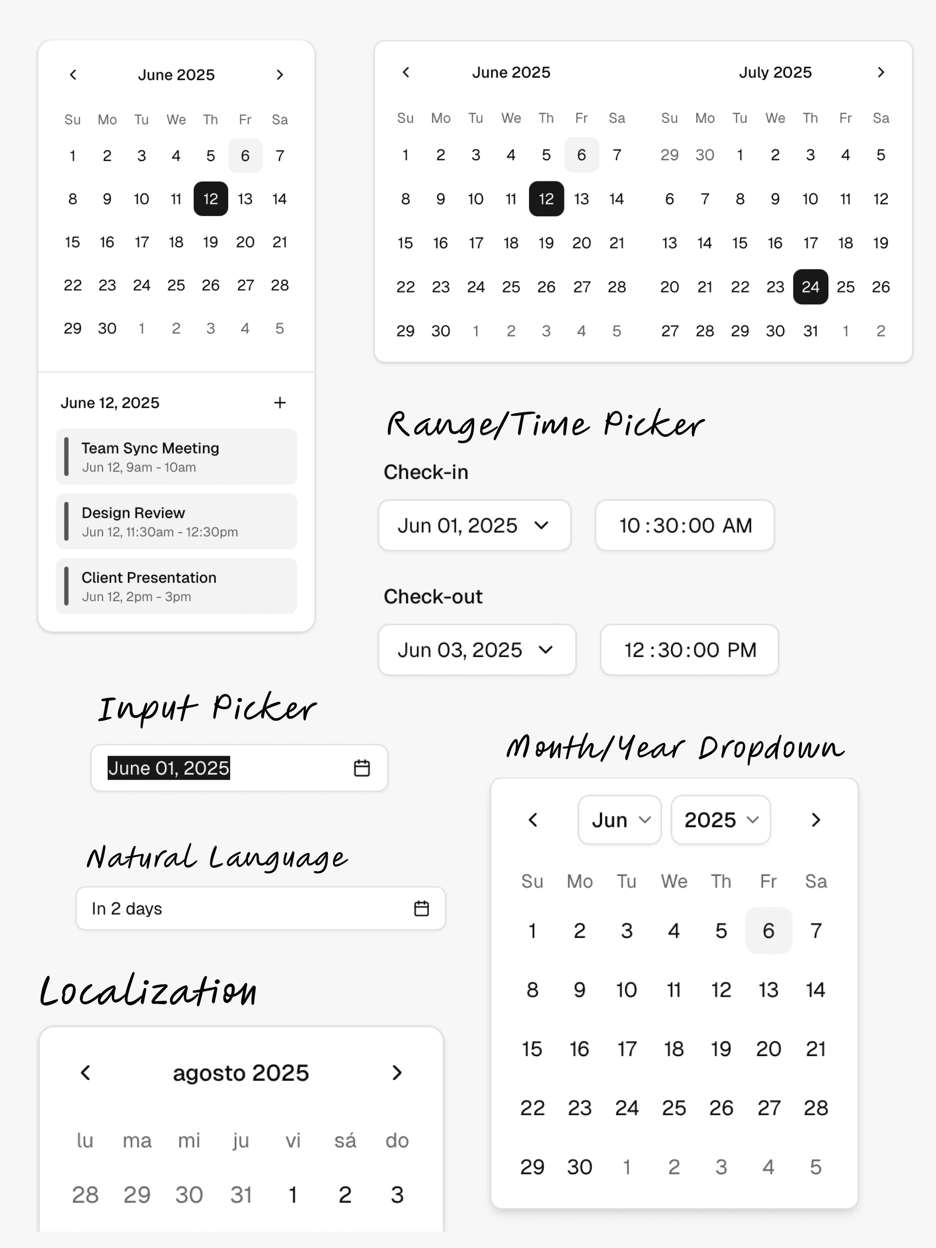
To upgrade your project to the latest version of the Calendar component, see the upgrade guide.
Build with DWL Components
Use the copied registry, charts, blocks, and create tools in one place.
Start from the DWL Components create flow and customize from there.
Open DWL Components Create